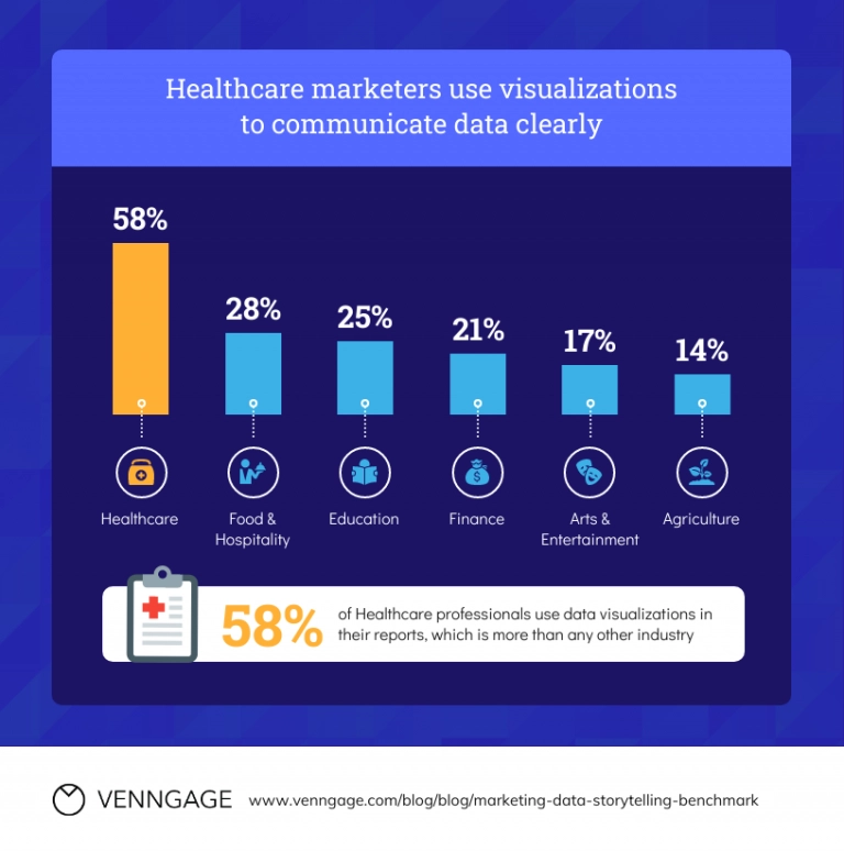
Nowadays, when big data is continuously generated and needs to be processed immediately, data visualization helps make actionable conclusions and faster decisions. So hospitals and healthcare systems, pharmaceutical companies, medical research institutions, and health insurance providers – all need the right health visualization tools.

The statistics also confirm the importance of data visualization in healthcare. According to Contrive Datum Insights, the global healthcare analytics market was valued at $35.3 billion in 2022. Growing at a CAGR of 21.4%, it is projected to reach $167.0 by 2023 (source ).
With profound expertise in engineering custom healthcare solutions, Binariks knows how data visualization can accelerate the performance of healthcare organizations. We offer custom healthcare software development services to enable businesses to leverage the full potential of their data.
Why use healthcare data visualization
There are many reasons why healthcare data visualization is rapidly gaining popularity. Firstly, the abundance of healthcare data generated every day has led to a need for better tools to analyze and interpret it. Data visualization provides a way to present large amounts of complex information in a simple, visual format that can be easily understood by healthcare professionals, patients, and policymakers.
Secondly, health data visualization has the potential to improve patient outcomes. Presenting data in a more visual format allows healthcare professionals to detect trends and patterns, which can inform treatment decisions and improve patient care.
For example, data visualizations can help identify patients at high risk of developing certain conditions, allowing clinicians to intervene early and prevent the deterioration of the disease.
Besides, data visualization can improve healthcare organizations' efficiency and reduce costs, as it reveals areas for improvement. For example, data visualization can be used to track the utilization of healthcare resources, such as hospital beds and medical equipment, and optimize their use to reduce costs.
The most common examples of healthcare data visualization types include:
- Charts and graphs to represent numerical data, such as patient demographics or disease incidence rates
- Diagrams and flowcharts for showing the flow of information or processes, such as the steps involved in a clinical trial
- Tables for presenting large amounts of data in a structured format
- Maps to show geographical patterns in disease incidence or healthcare resource utilization
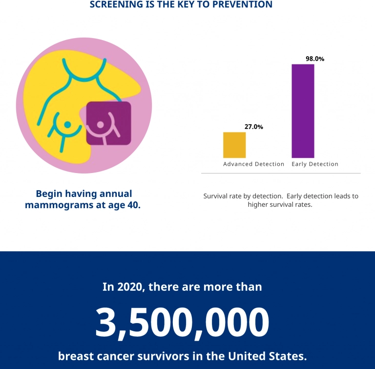
- Infographics for presenting complex information in a visually appealing and easy-to-understand format
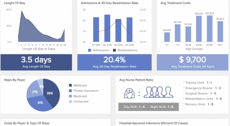
- Dashboards to provide an at-a-glance overview of key metrics and trends, allowing healthcare professionals to quickly identify areas that require attention
Let's consider how all these visual elements are used depending on the aim of the medical data analysis and how the same tasks would be performed without data visualization tools in healthcare.
Task | Without data visualization | With data visualization |
Data collection and accumulation | Manual collection of information involving too much time and effort | The streamlined process through automated data collection |
Calculations | Cumbersome handwritten calculations, error-prone and time-consuming | Instant and accurate calculations, eliminating manual errors |
Building graphs with conclusions | Complex visualization requiring advanced math skills | Automated graph generation with relevant analytical conclusions |
Access to data | Tedious retrieval of information from physical archives or repositories | Convenient remote access to data through secure login credentials |
Benefits of healthcare data visualization
Data visualization simplifies the understanding and interpretation of complex healthcare data, making it accessible to a wider audience. And by enabling stakeholders to comprehend and communicate insights effectively, visualization promotes data transparency. Yet, these are not all the reasons to implement data visualization techniques in the healthcare sector. Let's consider some of the longer-term benefits in more detail.
Improved decision-making and patient outcomes
One of the primary advantages of medical data visualization is the ability to analyze huge amounts of data quickly and efficiently, enhancing decision-making processes.
For example, the healthcare company Geisinger Health System used AI-based data visualization tools to identify high-risk patients who could benefit from early intervention (source ). As a result, they were able to improve patient outcomes and thus reduce hospital readmissions and related costs.
Enhanced operational efficiency and resource allocation
Data visualization can help healthcare organizations optimize their operations. Saint Joseph Mercy Health System used the iDashboards system, which visualization tools enabled the staff to share information in real-time and respond to reduced performance immediately.
Since adopting iDashboards data analytics and visualization technology, Saint Joseph Mercy Health System has improved the quality of care while saving time and keeping costs down. Various problems were solved, from reducing the times of delivery of meals to rooms to the improvement of the overall organization's hourly compliance rate by 78.9% (source ).
Identifying population health trends
Monitoring trends in population health is another important area of application of data visualization in healthcare.
Thus, the New York City Department of Health and Mental Hygiene (DOHMH) implements data visualization tools by HealthDataViz (source ). By analyzing personal health data such as chronic diseases, infectious diseases, and behavioral risk factors, the DOHMH gained valuable insights into the health patterns of different neighborhoods within the city.
With the help of healthcare data visualization tools, the DOHMH was able to detect emerging health issues and target interventions and resources accordingly.
For instance, they discovered a higher prevalence of asthma in certain neighborhoods, which led to the implementation of asthma prevention and management programs in those areas. Similarly, they identified communities with high rates of obesity and designed initiatives to promote a healthy lifestyle in those neighborhoods.
Engaging stakeholders and driving collaboration
Healthcare data visualization can also be used to drive collaboration in public health initiatives. One notable example is the Centers for Disease Control and Prevention (CDC). Across the CDC's National Syndromic Surveillance Program (NSSP), dashboards and data visualizations are available to illustrate topics of public health interest (source ).
NSSP collects and analyzes real-time data from emergency departments, care centers, laboratories, etc., to improve syndromic surveillance and public health response. And transforming the raw data into interactive visual representations makes it easier for public health officials, epidemiologists, and other stakeholders to explore and interpret the data.
Enhancing patient education and empowerment
Probably all health apps and software use digital medical data graphical representations in this or that way. And most of these apps aim to either raise general health awareness or improve knowledge of particular conditions. In any case, visualization helps users understand complex data better.
MyHealthTeam, a social network for patients with chronic conditions, is no exception (source ). It utilizes data visualization techniques to enhance patient empowerment and drive treatment adherence.
For example, users with diabetes can visualize their blood sugar levels, medication adherence, and physical activity in easy-to-understand charts and graphs.
Using patient data visualization, MyHealthTeams enables users to understand their progress, make informed decisions about their self-care, and engage with a supportive community.
Identifying cost-saving opportunities
By visually analyzing healthcare expenditures, organizations can pinpoint areas of inefficiency, unnecessary expenses, or patterns that contribute to high costs. For example, Aetna, a leading health insurance company, utilized data visualization to identify members at risk for high-cost healthcare services.
Thus, Aetna can implement targeted interventions and preventive measures, resulting in substantial cost savings and improved patient outcomes (source ). Visualization enables healthcare organizations to optimize resource allocation, reduce wasteful spending, and ultimately enhance financial sustainability.
Empowering Healthcare Company with Data Visualization
We created a COVID-19 testing app for digital health company
Sources of medical data for further visualization
Data visualization plays a crucial role in the healthcare industry, drawing insights from a diverse range of reliable and statistically sound sources. When it comes to obtaining medical data for visualization purposes, the following sources can be considered:
- EHR and EMR solutions
EHR (Electronic Health Record) and EMR (Electronic Medical Record) systems serve as comprehensive repositories of qualitative and quantitative patient health data. For example:
- Individual medical histories
- Diagnoses and treatment plans
- Health data collected through IoT (Internet of Things) medical devices
- Lab test results
- Administrative and billing data
- Patient demographics
- Data collection forms
Patient data and feedback can be derived from data collection systems, such as:
- Census and survey reports
- Scorecards for health tracking
- Patient self-reporting forms
- Insurance company databases
- Case report forms
- Clinical trials
Clinical trials investigating innovative medical products and methods generate valuable health information. The data collected during these trials is meticulously recorded in databases and subsequently subjected to rigorous analysis and interpretation. This process provides deeper insights into the effectiveness and safety of new medical interventions.
- Wearable and portable devices
By capturing data on vital signs, physical activity, sleep patterns, and other health parameters, medical wearables contribute valuable information for clinical data visualization and analysis. Besides, they cater to diverse groups, genders, ages, health conditions, etc.
Such devices include but are not limited to:
- Fitness trackers
- Pulse oximeters
- Wearable ECG and EEG monitors
- Wearable blood pressure monitors
- Glucose monitoring systems
- Various types of biosensors
- Third-party platforms
Additionally, third-party platforms provide access to aggregated medical data from multiple sources, including hospitals, clinics, research institutions, and other healthcare providers. These platforms often offer standardized and anonymized data, allowing for comparative analysis and benchmarking.
The effective visualization of medical data from the above sources facilitates data-driven decision-making, improves patient care, and supports advancements in medical research.
Web Platform for Patient Management
Simplifying remote patient monitoring through data visualization
Use cases of data visualization in healthcare
Tools for healthcare visualization may include interactive dashboards, apps, widgets, infographics, motion graphics, and more.
Depending on the form, they can be used for different purposes, like enhancing decision-making, engaging patients, analyzing data trends, or simply making information more accessible for recipients.
Interactive dashboards
Interactive dashboards provide real-time insights and customizable views of key healthcare metrics, enabling professionals to monitor patient demographics, disease prevalence, and treatment outcomes. They facilitate data exploration and informed decision-making, improving care delivery.

Interactive apps, sites, and widgets
Interactive tools like apps, websites, and widgets engage patients by displaying personalized health information, such as vital signs and medication schedules. Real-time monitoring, progress tracking, and educational resources empower individuals to participate actively in their care.
Infographics and motion graphics
Infographics simplify complex medical concepts using visuals, icons, and charts. Motion graphics enhance engagement through animation and narration, making them particularly effective for health education campaigns and public awareness initiatives.

Geospatial visualizations
Geospatial visualizations identify geographic disparities in health outcomes and resource allocation. By overlaying demographic data and disease prevalence on maps, they help policymakers target interventions for better population health.
Time-series visualizations
Time-series visualizations track changes in health data over time, evaluating trends and forecasting resource needs. They are used to monitor disease outbreaks, assess treatment effectiveness, and understand the long-term impact of public health measures.
Conditions for medical data visualization
To unlock the full potential of medical data visualization, several conditions need to be met:
- Sufficient amount of medical data: Adequate data is essential for meaningful visualizations. Sizable and diverse datasets provide a comprehensive view of patient health, enabling accurate analysis and identification of trends, patterns, and correlations.
- Well-elaborated mathematical models supporting patient data visualization: Robust mathematical models are crucial for translating complex medical data into visually interpretable representations. These models should consider various factors, such as data distribution, statistical analysis, and data transformation techniques, ensuring accurate and meaningful visualization outputs.
- Convenient clinical data visualization toolbox and interface: The availability of user-friendly tools and interfaces is essential for efficient data visualization in the clinical setting. Healthcare professionals should have access to intuitive and customizable visualization platforms that allow for easy exploration, manipulation, and interpretation of medical data. This includes features such as interactive dashboards, drag-and-drop functionality, and real-time updates.
- Data privacy and security: Effective visualization also requires adherence to strict data privacy and security measures. Safeguarding patient confidentiality and complying with legal and ethical standards is crucial to maintain trust and ensure the responsible handling of sensitive medical information.

Popular healthcare data visualization tools
Let's take a look at several popular ready-made solutions to make data visualization for healthcare easy and efficient:
- Tableau: Tableau is a leading data analytics platform with wide functionality and machine learning tools. It is user-friendly and has a simple workflow based on a drag-and-drop feature. So, even users without technical expertise can create line charts, graphs, histograms, and other visual representations.
- Power BI: Developed by Microsoft, Power BI is a user-friendly business intelligence tool that enables interactive dashboards, reports, and visualizations. Its integration capabilities and advanced analytics features make it a popular choice in healthcare.
- QlikView: QlikView offers intuitive drag-and-drop functionality and powerful data exploration capabilities. Its associative model allows dynamic navigation and uncovering of hidden insights, making it valuable for visualizing complex medical data.
- Looker: Looker is a cloud-based data platform that provides a centralized hub for accessing, exploring, and visualizing medical data. Its customizable features and collaborative capabilities facilitate seamless sharing and collaboration among healthcare professionals.
- Plotly: Plotly is an open-source library supporting various programming languages. Its rich set of chart types and customization options make it popular for detailed and personalized representations of medical data.
Challenges in visualizing data
Healthcare organizations face several common challenges when it comes to visualizing data.
One significant issue is the need to unify disparate data sources. The healthcare sector generates a vast amount of data from various sources, each with its format and language. Aggregating these diverse datasets for comprehensive visualization projects is complex and time-consuming.
In addition, many healthcare organizations struggle with siloed data assets, repositories, and analyses. This fragmentation, combined with limited accessibility to visualization systems, hampers the generation and collaboration of data visualization projects. These barriers prevent organizations from fully leveraging their data analyses and deriving meaningful insights.
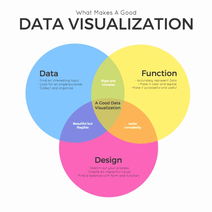
Furthermore, a lack of emphasis on data visualization in education and training programs for data experts compounds the challenges. Visualizing data goes beyond simply transforming the analysis into a graph. Design principles, such as color theory and chart type, play crucial roles in creating efficient visualizations.
Overcoming these challenges requires healthcare organizations to invest in integrated data solutions, foster collaboration across departments, and prioritize training programs emphasizing data visualization.
How to implement software for data visualization
Generally, the strategy for data visualization software implementation plan involves the following steps:
- Assign an experienced specialist to research and compare existing software packages for healthcare data visualization. Determine whether any ready-made solution can meet your company's particular needs.
- Decide if you need to integrate a graphical module or application with visualization and analytical features into the existing EHR or EMR system.
- Assess the need for a bespoke software solution. Create a plan outlining desired features, tools, and platforms. Besides, decide on the amount you are ready to invest.
- Hire a team of developers experienced in building healthcare data visualization solutions. Consider different software development companies and collaboration models available in the healthcare sector.
- Finally, do not abandon the software development outsourcing option. This may include project management, software engineering, and quality assurance for healthcare visualization tools. Collaborating with external experts can provide unique knowledge and resources.
- Throughout the implementation process, ensure regular communication between the software development team and key stakeholders. Conduct thorough testing, validation, and training to ensure the software meets the desired requirements.
Work with Binariks for healthcare data visualization
Binariks provides its analytical services to organizations across multiple industries, including healthcare.
In particular, we have extensive experience in healthcare data visualization and can assist you in visualizing the processed data or integrating analytical features into existing applications.
In our projects, we develop interactive dashboards, visual analytics platforms, and reporting systems, enabling healthcare providers to gain valuable insights from their data.
Binariks offers customized solutions for patient data visualization, clinical research analysis, and healthcare performance monitoring
Conclusion
Data visualization is a key aspect of health informatics that offers cognitive support by facilitating intuitive insights into complex information. And in the rapidly evolving healthcare landscape, the significance of this tool cannot be overstated.
As the industry becomes increasingly data-driven, the ability to effectively analyze and act upon complex insights is paramount.
Healthcare providers, pharmaceutical companies, digital health startups, and other industry stakeholders that recognize this importance and invest in advanced analytics and data visualization solutions will gain a competitive edge.
By using the power of visual representations, organizations can make informed decisions, enhance operational efficiency, and ultimately improve patient outcomes.
Embracing data visualization today lays the foundation for long-term success in a data-centric future
FAQ
Share

