Effective design isn't just a nice-to-have in the healthcare world, where patient trust and well-being are non-negotiable. It's a crucial weapon in your arsenal. Healthcare websites and apps serve as the gateway to patient experiences, shaping their first impression of a healthcare provider, deciphering medical gibberish into understandable language, and igniting patient involvement.
Are you a healthcare organization seeking to revamp your digital presence and craft a seamless patient journey? Well, this article is your ticket to a realm of possibilities. We'll dissect five game-changing design hacks that transform your healthcare websites and apps into engaging, informative, and user-friendly playgrounds.
So, fellow healthcare enthusiasts, let's witness the power of well-crafted healthcare web design and elevate patient care to new heights.
Understanding the unique needs and key elements of healthcare websites
To craft a trustworthy online presence and exceptional patient experience, healthcare organizations must prioritize empathy-driven design principles, placing themselves in the shoes of their users and understanding their unique needs. This involves healthcare website design with the following:
- Intuitive navigation: A seamless and user-friendly navigation structure is crucial for effortlessly guiding patients through the website's various sections. Clear menus, consistent branding, and well-organized content hierarchies foster a positive user experience.
- Compelling visual language: Web design for hospitals should incorporate high-quality visuals that evoke a sense of calm, trust, and professionalism. Use calming color palettes, clean and uncluttered layouts, and high-resolution images and videos to enhance the overall visual appeal.
- Accessible and informative content: Prioritize clear and concise language, avoiding medical jargon and complex terminology. Use straightforward explanations, infographics, diagrams, and videos to break down complex medical concepts into easily understandable segments.
- Personalized patient experience: Healthcare websites should offer personalized experiences that cater to individual needs and preferences. Allow patients to create profiles, save preferences, and access tailored content based on their specific conditions and interests.
- Mobile-friendliness: In today's mobile-centric world, healthcare websites must be optimized for seamless navigation and functionality across all devices, including smartphones and tablets. Adaptable layouts, responsive designs, and mobile-friendly content ensure a consistent user experience regardless of the device used.
- Ease of appointment scheduling: Streamline the appointment-scheduling process by providing easy-to-navigate tools that integrate seamlessly with the healthcare provider's scheduling system. Clear and straightforward instructions, real-time availability checks, and multiple scheduling options enhance patient convenience.
- Secure patient portal: Offer patients secure access to their medical records, communication with healthcare providers, and personal health management tools through a dedicated patient portal. Employ robust security measures to protect sensitive patient information.
- Brand identity elements: Healthcare website design should consistently showcase the organization's brand identity through cohesive logo usage, color palettes, and typography. Consistent branding reinforces recognition and establishes a professional, trustworthy image.
- Call-to-Action (CTA) buttons: Clearly visible and strategically placed CTA buttons should prompt patients to take desired actions, such as scheduling appointments, requesting consultations, or learning more about specific services. Use concise and compelling language to guide patient engagement.
- Accessibility for all: Healthcare websites should adhere to accessibility guidelines and incorporate features that cater to users with disabilities, such as screen readers, alternative text for images, and keyboard navigation. Inclusive design promotes inclusivity and reinforces the organization's commitment to patient-centricity.
- Data security: Hospital website design must prioritize patient data security, implementing robust data protection measures to safeguard sensitive information.
- Regulatory compliance: Websites and apps must adhere to all applicable healthcare regulations and guidelines, ensuring compliance with data privacy laws and ethical practices.
Also, while patient-facing aspects are crucial for fostering trust and engagement, the needs of healthcare professionals should not be overlooked. A dual user base demands a design approach that is both patient-centric and clinician-friendly. Medical expert can use healthcare website design with:
- Intuitive navigation for rapid access to patient records, scheduling , and communication tools
- Clear and concise medical information for quick comprehension of patient conditions
- Comprehensive medical data integration with PMS for streamlined workflows
- Telemedicine support for remote patient consultations and monitoring
By incorporating these essential healthcare web design principles, organizations can create websites and apps that not only comply with regulatory requirements but also foster trust, enhance patient engagement, and ultimately improve patient outcomes.
Healthcare website design tips you should follow
Healthcare organizations should focus on making it easy for people to understand and decide about their health. Here are some essential design tips to help you create a healthcare website that engages, informs, and inspires.
1. Embrace the power of white space
As information overload is a constant threat in healthcare, white space has become a precious commodity. This strategic use of negative space creates a sense of calm, promotes clarity, and enhances the overall aesthetic appeal of the website or app.

Study shows that using whitespace between paragraphs and in the left and right margins increased comprehension by almost 20%. Also, users tend not to recall more than one or two highlighted items (Source ). White space around the highlighted items tends to increase their prominence. So, if you have problems with engagement or low clicks, consider your medical website redesign.
2. Implement search functions for enhanced navigation
Providing a robust search function is essential in a healthcare environment where patients often have specific questions or concerns. This intuitive tool empowers patients to quickly find the information they need without getting lost in the website's content.
A successful website requires a seamless user experience, easily navigable pages, and valuable content. However, according to Search Engine Journal, there's one website feature considered even more crucial than the rest. More than 40% of respondents believe that the search bar surpasses everything else in importance (Source ).
Another research shows that 69% of consumers go straight to the search bar when they visit an online retailer. This study is valid for the healthcare industry if you think of clinics and other medical institutions as businesses that sell their goods and services (Source ).
3. Visualize data for easier understanding
In the healthcare industry, where complex medical information is often presented, data visualization can play a transformative role in making it more accessible and understandable. Healthcare websites and apps can break down complex concepts into digestible visual elements by employing infographics, charts, and diagrams.
A UCLA study suggests that vision contributes to 80% of human learning. Our preference for video, animation, and imagery over text isn't solely due to our short attention spans in modern times. It's also because visuals allow us to grasp and retain information quicker, more effectively, and for extended periods. Visual content is easier to comprehend and recall, making it a more digestible and memorable form of information (Source ).
Based on research compiled by 3M, visuals are processed 60,000 times faster than text. This means you can convey information to your audience more quickly with an actual picture. Dan Zarrella, HubSpot's social media scientist, discovered that tweets containing images are 94% more likely to be retweeted than tweets without images (Source ).
4. Ensure ADA compliance for inclusive design
The Americans with Disabilities Act (ADA) mandates that websites and apps must be accessible to people with disabilities. This includes individuals with visual impairments, hearing disabilities, and motor impairments.
According to the General Assembly of the United Nations, 1.5 billion people worldwide have a disability, and these people may also need high-quality healthcare services and the opportunity to use websites easily. It's a great way to reach new audiences with your marketing and improve compliance in your organization.
In the United States alone, individuals with disabilities possess an annual discretionary income exceeding $200 billion, and on a global scale, this figure rises to nearly $7 trillion. By ensuring your content is accessible to them, you have the potential to broaden your market share significantly (Source ).
By adhering to ADA compliance guidelines, healthcare organizations can ensure that their websites and apps are usable by all, regardless of their abilities. This inclusive approach not only promotes accessibility but also demonstrates the organization's commitment to diversity and inclusion.
5. Utilize social proof to build trust
Social proof, the tendency to trust the opinions of others, can play a significant role in influencing patient decisions. By incorporating positive patient reviews, testimonials, and professional affiliations, healthcare organizations can build trust and establish credibility.
In 2004, UK researchers explored trust in health websites, emphasizing web design versus content . Surprisingly, 94% linked distrust to design, while only 6% cited content. This highlights the paramount role of web design in shaping user trust (Source ). Another way to build trust is by showcasing positive feedback and endorsements. Healthcare organizations can demonstrate their expertise and encourage potential patients to choose their services.
Do these tips apply to healthcare app design?
Yes, the design tips discussed above apply to healthcare app design as well as healthcare website design. In fact, these tips are even more critical for healthcare apps , as users are more likely to be using them on mobile devices and in a more time-sensitive setting.
In addition to these general tips, there are some specific design considerations for healthcare apps. For example, the app should be designed to be used in various settings, such as in a doctor's office, at home, or on the go. The app should also be able to handle multiple tasks, such as managing appointments, communicating with healthcare providers, and tracking health data.
When working on healthcare app design, it is essential to consider the following factors:
- The target audience: Who are you trying to reach with your app? What are their needs and expectations?
- The app's purpose: What is the app supposed to do? What problem is it trying to solve?
- The app's features: What features should the app have? How will these features benefit users?
- The app's user interface (UI): The UI should be intuitive, easy to use, and visually appealing.
- The app's user experience (UX): The UX should be seamless and efficient. Users should be able to easily find what they need and accomplish their tasks without any frustration.
So, how to design a medical app? By carefully considering these factors, you can create a medical app that is user-friendly, effective and meets the needs of your target audience.
Transform your digital landscape with our customer-centric UI/UX design services
Top 3 medical design examples
DialogTech reports that 5% of all Google searches are health-related, with many users seeking information on reliable medical websites. Evaluating a website's quality involves checking ratings and user reviews. The design of medical websites plays a crucial role; some have impressive designs, while others need improvement to gain popularity.
Let's check out some of the best examples of medical website design.
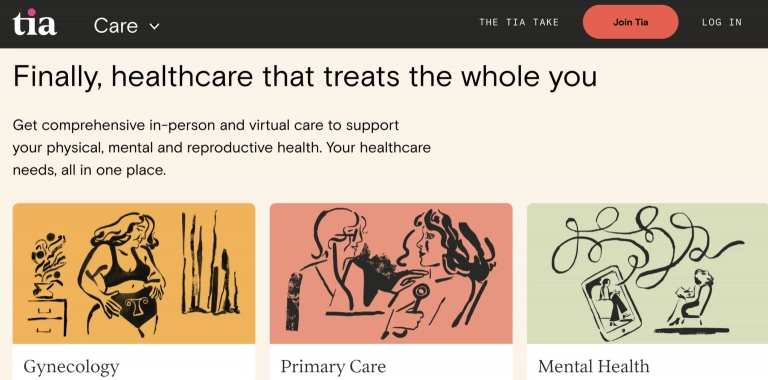
Tia
Tia is a great medical web design example. This women's health website employs a modern and stylish theme to attract individuals seeking women's healthcare solutions.

Tia incorporates custom, vibrant graphics for attention-grabbing visuals, utilizing high-resolution and authentic images to strengthen their brand, and employing web-safe fonts for easy content readability on their website.

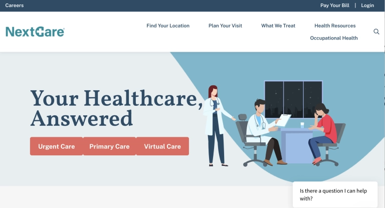
NextCare
NextCare healthcare brand utilizes graphics and modern design to craft an inviting experience for website visitors.

NextCare incorporates simple icons to draw attention and emphasize values, seamlessly integrates a chatbox for convenient customer service, and incorporates testimonials to foster trust with visitors.

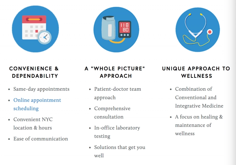
Integrative Medicine of NYC
Another excellent healthcare web design example is Integrative Medicine of NYC. This practice welcomes visitors with an eye-catching logo and high-quality imagery the moment you land on their homepage.

The brand utilizes a simple and modern design that avoids over-cluttering, integrates icons and graphics to enhance messaging, and adopts a straightforward layout of services to communicate what it offers clearly.

We hope these great medical website examples will help you change your approach for the best.
Binariks as your healthcare website design team
Today, websites are much more than pixels and code. They're the first touchpoint, building trust and guiding patients' experiences. At Binariks, we understand this. We're not just web designers but your partners in crafting healthcare websites that help heal, inform, and engage.
We know navigating healthcare regulations and prioritizing data security are paramount. That's why we leverage our expertise to design websites that comply with legal frameworks and safeguard sensitive information with cutting-edge tech. But it's not just about compliance.
We believe in empathy-driven design, creating user-friendly interfaces and engaging visuals that empower patients and build trust. We optimize for mobile, tell your brand story through compelling media, and continuously analyze user data to improve your website's performance.
Ready to create a healthcare website that makes a difference? Contact Binariks today and let's design a digital experience that empowers your clinicians and patients.
Final thoughts
Crafting a successful website design for healthcare companies requires more than technical expertise; it demands empathy, trust, and a commitment to user experience. Each design choice should resonate with patients, foster engagement, and empower them to navigate their health journey with clarity and confidence.
Remember, your website is not just a digital brochure; it's a lifeline, a bridge between patients and providers. By prioritizing empathy-driven design, data security, and user experience, you can create a website that adheres to regulations, humanizes healthcare, fosters trust, and ultimately improves patient outcomes.
The healthcare landscape is constantly evolving, but with strategic design principles and a dedication to continuous improvement, your website can remain a beacon of trust and information for years to come. So, invest in design, prioritize empathy, and create a healthcare website that genuinely makes a difference in the lives of your patients.
Share

